 |
For the book designer, the Bible presents a two-fold challenge.
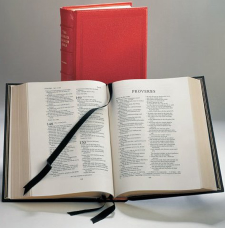
First, over the centuries, the Bible as a physical artifact has come to be associated with a distinctive look—double columns, small type, chapter and verse divisions—and deviating from that look can be a risky proposition for the Bible publisher. Second, if form can indeed be presumed to follow function, the inevitable conclusion drawn from this traditional format is that the Bible, like the dictionary and the phone book, must be meant not so much for reading as for looking things up.
Of course, there’s a reason why Bibles are formatted like oversized reference volumes: the sheer number of words. To fit them all between the covers, designers use miniscule type, shoving as many words onto the page as possible, printed on the thinnest of papers, all in an effort to keep the potentially mammoth proportions of the book in check.
Since I started Bible Design Blog, my inbox is filled with messages from people looking for the impossible. The typical request looks like this:
Dear Mark,
I am searching for a large print (12 pt. or above) Bible with extra-wide margins, printed on heavy, opaque paper, with an overall thickness of no more than one inch (though half an inch would be ideal). Can you help?
And I never can. Thanks to the volume of words, every design choice involves a trade-off. Large type and wide margins don’t go together, and neither do heavy, opaque paper and thinline editions.
Since each choice negates another, it’s important to begin at the beginning. What is the Bible really for? If the answer is looking things up, you’ll make one set of choices. But if the Bible, first and foremost, is meant to be read, you’ll make others.
Better Bibles: paragraphed text
Consider paragraphed text. Crack open most editions of the King James Version, and you’ll find every verse set off on a line of its own. While the old format makes looking up a particular phrase much simpler, the way it chops up the text does no favors for the reader interested in the flow of words. In contrast, modern layouts typically feature paragraphed text. Why? It’s easier to read. To promote the goal of readability, designers have had to make it a little harder to look things up.
Still, there’s a long way to go. In spite of their paragraphed text, most contemporary editions are a far cry from reader-friendly. The most obvious difference between them and the average book is the use of two columns instead of one. The reason is simple: smaller type stretched across a single column becomes impossible to track, so designers have to choose between larger text (increasing the number of pages, and therefore the book’s thickness) and two columns of smaller text. For the most part, they’ve chosen the latter.
The NEB: shape of things to come
But the exceptions are fascinating to consider. When the New English Bible made its debut in the early 1970s, a conscious decision was made to avoid double columns. Instead, every variable—typeface, layout, and paper—was carefully chosen to create an elegant and highly readable single column design, a Bible that would look to readers like a contemporary book, rather than a dictionary. The designers even moved verse numbers to the margin, so that the text could flow without interruption.
When the Revised English Bible came along, however, these reader-friendly innovations fell by the wayside. As Roger Coleman writes in New Light and Truth: The Making of the Revised English Bible, while the “NEB had been designed as a text that would be used for comparative study or general reading,” the REB was “treated from the beginning as a book that must lend itself to use by Christian worshippers.” That meant a return to double columns and verse numbers in the text.
Recent single column editions
The success of The Message Remix, Eugene Peterson’s paraphrase set in a contemporary, single column format, seems to have convinced publishers that a reader-friendly design can succeed in the marketplace. While there is not yet a deluge of single column Bibles, interest is building, and there are several notable editions worth mentioning.
Both Zondervan’s TNIV Reference Bible and Crossway’s ESV Personal Size Reference Bible offer a more conservative approach to the single column setting than either the NEB or The Message Remix. Verse numbers are in the text, and references off to the side (the outer column in the TNIV’s case and, quite innovatively, the inner column with the ESV). This satisfies the churchly need to look up verses easily while giving the reader a single column format.
Cambridge has breathed new life into the King James Version with its New Paragraph Bible. While the leather-bound edition is quite large, the same single column, paragraphed text is now available as a Penguin paperback, the most readable edition of the KJV currently available. For readers of the NIV, Cambridge also produces a fine single column setting of that translation.
Then there’s The Books of the Bible, an ambitious International Bible Society project that moves chapter and verse divisions from the TNIV to the margin, and restructures and re-orders the books to provoke a fresh encounter with the text. While it tends to provoke extreme love/hate reactions, there’s no question it’s one of the most thorough attempts so far to engage the reader of the Bible through design choices.


