M
Maps tell a story. They tell us where we are, where we’ve come from, and where we are going. They expose our biases, explore our comforts, and force us to ask questions about why the world is the way it is. The following series of maps shows pieces of an interconnected and multi-dimensional puzzle. Some connect two or three data points; others show a fuller picture. Almost all US counties are ranked according to poverty rates, unemployment rates, religious participation rates, number of social associations per ten thousand people, one-person-household rates, and marital status. Those lacking data were removed. From there, I averaged the scores from each county to find what I am calling the loneliness index. All data were weighed equally. Maps reveal what, but they do not answer why. These maps in particular show only conditions in which people are likely to be lonely. They do not say with certainty that people in these areas are in fact lonelier.
Map 1: Marital Status and Single-Person Household

We see high concentrations of people who are unmarried and those who live alone in the Deep South, in New Mexico, and in Pennsylvania up into the Northeast. The Rust Belt, Upper Midwest, and Mountain West also show higher concentrations than the areas around them.
Map 2: Social Associations and Religious Participation

Appalachia, the Northeast, Michigan, Florida, and the West Coast all show low religious participation rates coupled with few social associations. I’m surprised by the stark contrast between the West Coast, Mountain West, and Midwest. Utah, for example, has high religious participation rates but low numbers of social associations. Is that because the Church of Latter-day Saints is active enough in communities that social associations tend not to take root? Or is it a lack of data? This map tells an interesting if incomplete story that needs more research than public data can provide.
Map 3: Poverty and Unemployment

Map 3 shows high concentrations of poverty and unemployment on the West Coast, in the Southwest, in the Deep South, and into Appalachia. Poverty is commonly understood as a lack of financial or material resources, but it results in an inability to participate in society: sports groups, service clubs, and fitness classes all come with an annual fee. Even when aid is available, there is a certain shame in accepting it. Studies show that those with part-time jobs experience higher levels of loneliness than those with full-time jobs. And those in poverty may work more than one job, robbing them of time to spend on activities with others. Unemployment is likewise an isolating experience. Our jobs take up much of our time; we spend most of our days at work. With that time we build connections with co-workers. Unemployment takes away the close and peripheral connections we make each day.
Map 4: Loneliness Index

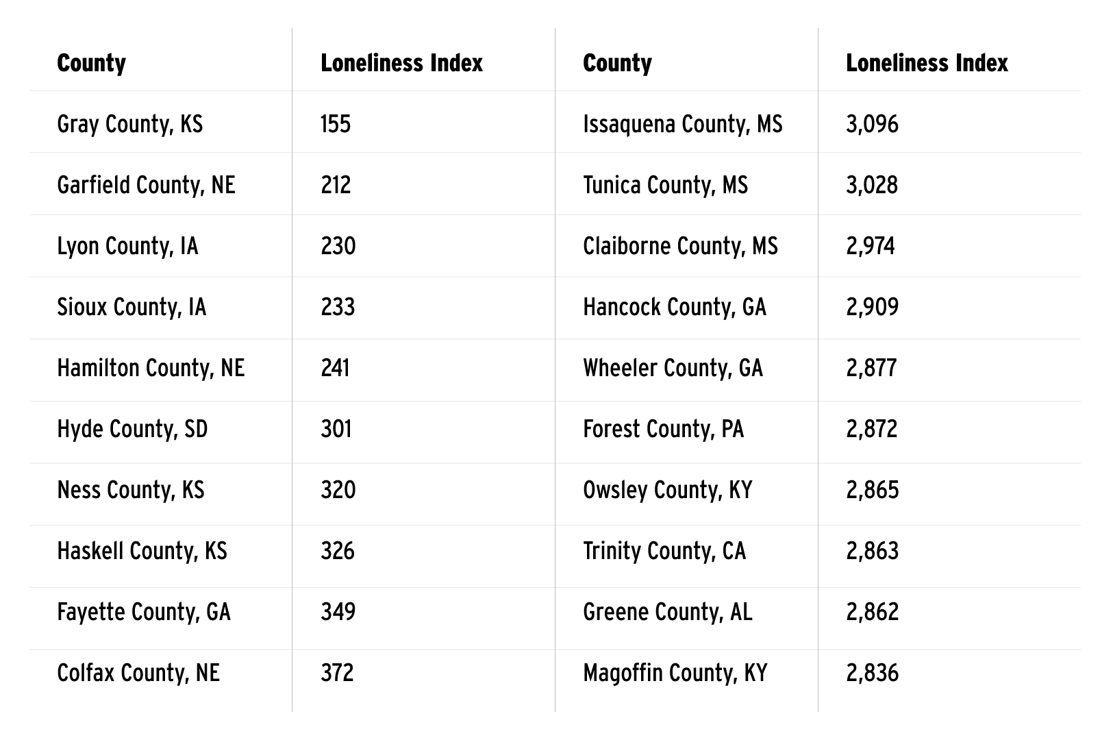
Map 4 illustrates the loneliness index. The loneliness index is the average of all rankings. According to the index, conditions for loneliness are most acute in the Deep South and Appalachia, and on the West Coast and in the Southwest. The data show that the highest-scoring counties are almost fully in the Appalachia region and the Deep South, while the lowest-scoring counties are centred on the upper Midwest. You can also find the lowest- and highest-ranking counties in the table below:
These maps are a starting point. They reinforce the findings of a report published by the surgeon general in 2023: we are a lonely people. But the geography of loneliness is complicated. It’s not easily explained by one map, or twenty. The systemic nature of so many of these societal ills means that one fix won’t bring about major change. Being less lonely will not raise people out of poverty; it will not find those without work a new career; it will not solve addiction. The conditions that cause our loneliness may be unique region to region and circumstance to circumstance, but the feeling is universal, and we’ve fallen under its sway.